LUNA is a web application which means it is built to accommodate all screen sizes and types, from large desktop monitors, to tablets and mobile smartphones. Due to the space constraints that smaller screens enforce, LUNA employees a practice known as “Responsive Design” which means that elements on-screen can appear in different locations depending on the device you’re using.
In many cases, some elements are hidden on smaller screens that would normally be visible on larger ones. This article demonstrates some of those adjustments that are automatically handled so you can enjoy LUNA across all of your devices with ease.
Desktop Mode
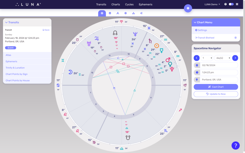
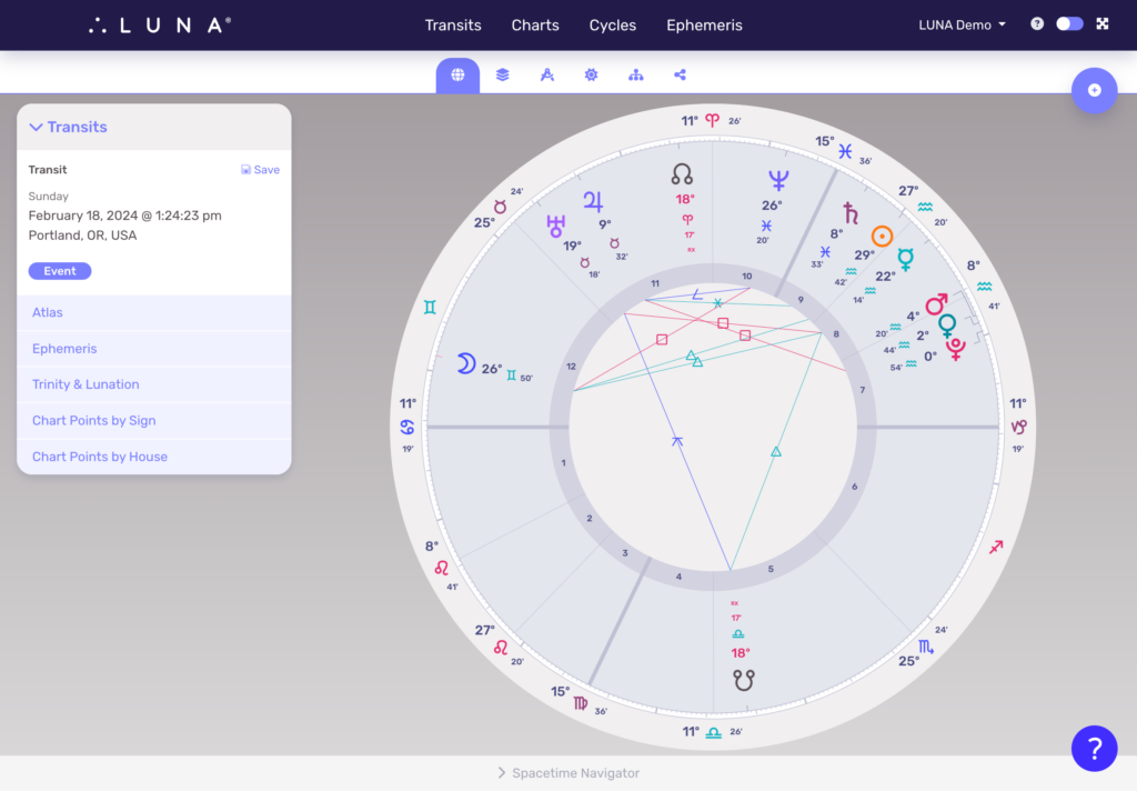
When viewing LUNA in Desktop Mode, your charts always appear in the middle of your screen and scaled-to-fit for optimal display. The left side of your screen displays one or more Info Panels depending on whether you’re viewing a uniwheel or a biwheel, while the right side always shows the Chart Menu on top, with contextual chart controls below it.
Whether you enlarge or reduce the size of your desktop window, the chart size adjusts accordingly.
On both desktop and mobile versions, you can pinch and zoom into the screen for a closer viewing of the chart.
Tablet Mode
LUNA will look slightly different on a tablet depending on whether you’re viewing it in portrait or landscape orientation. Notice in the examples below that when space is available in landscape orientation, the left side Info Panel(s) appear. When in portrait orientation, however, the view is more similar to Mobile Mode (see below).
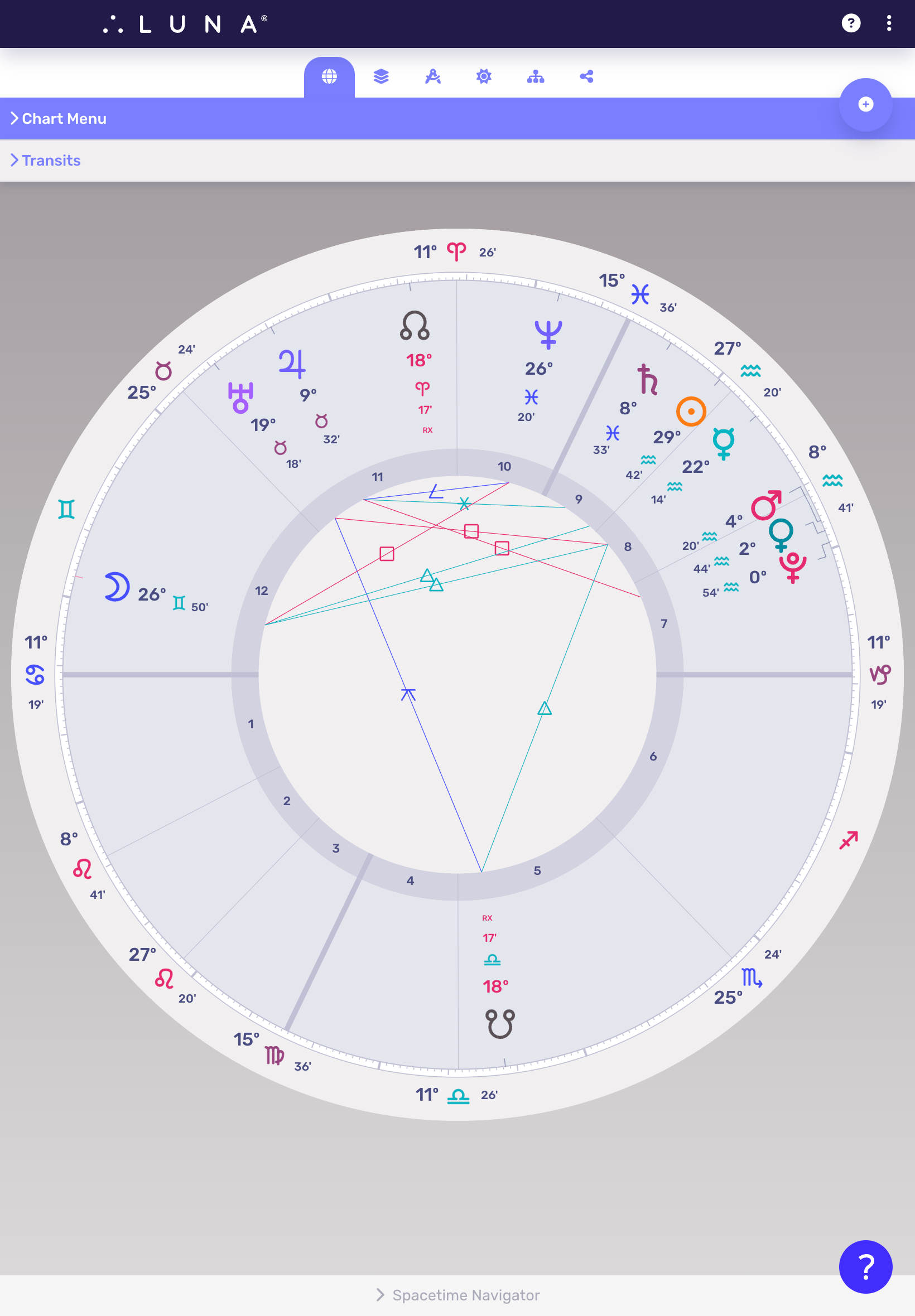
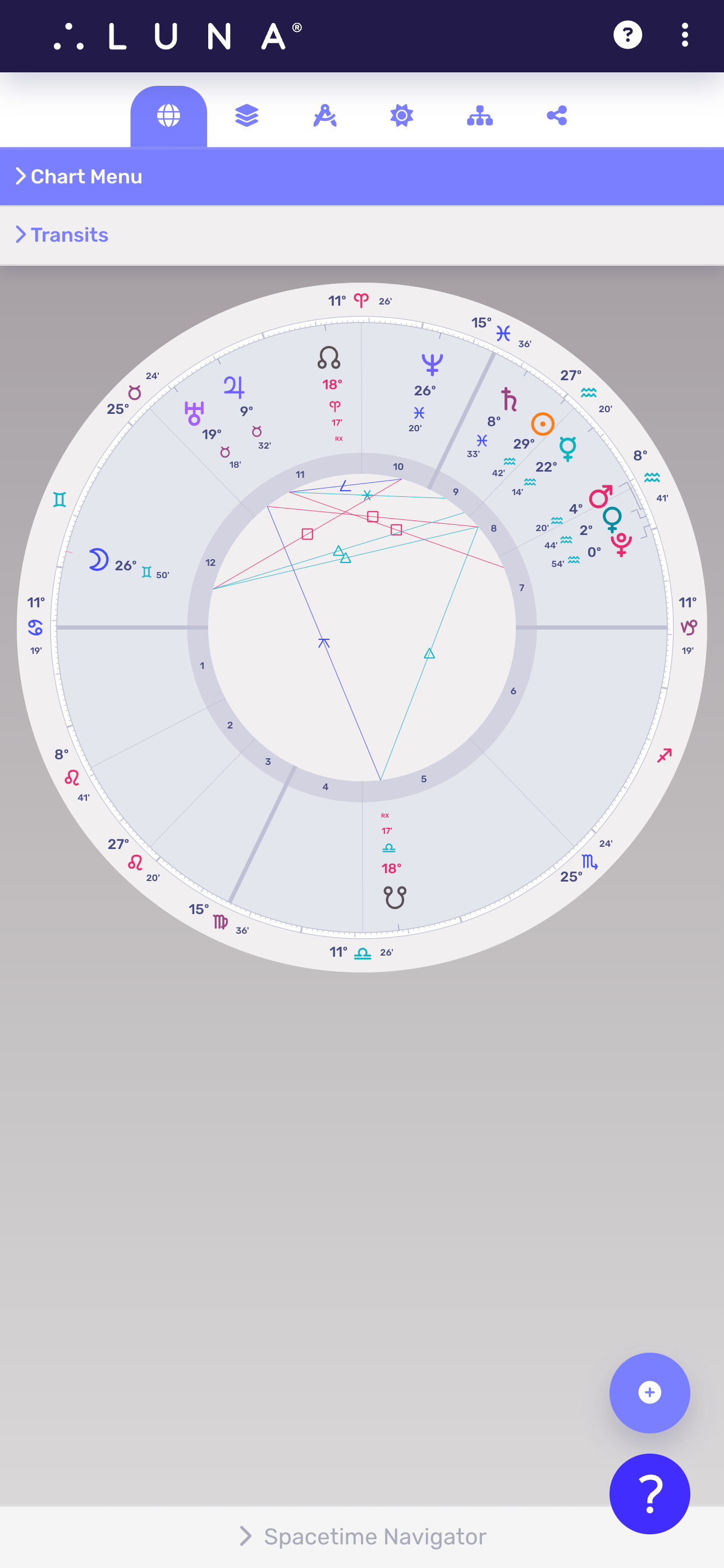
Mobile Mode
When viewing LUNA on your smartphone or other very small screen, you will notice that all of the panels that were to the left and right of the chart are now collapsed into “drawers” which can be tapped open to reveal more details.